We are going to explore the basics of Statistics using Python. And we'll go through the following:
- Importing the data;
- Apply summary statistics;
- Other measures of variability (variance and coefficient of variation);
- Other measures of position (percentile and decile);
- Estimate the Skewness and Kurtosis; and bonus,
- Visualize the histogram;
Data -- volume of palay (rice) production from five regions (Abra, Apayao, Benguet, Ifugao, and Kalinga) of the central Luzon, Philippines. To import this, execute the following:
To check the first and last five entries of the data, use
The descriptions of the row labels:
Therefore, the volume of production in Kalinga is more disperse than the yields on other regions. Another measures of variability (relative variability) is the coefficient of variation (CV), which is defined as
The CV is unit-less when it comes to comparisons between the dispersions of two distributions of different units of measurement. So assuming the yields from 5 regions have different units, then Abra is more variable than the other regions (Why? That is because the sample mean in Abra is more concentrated on the lower values, see the histogram below, and the range from its mean to its maximum is 47428.620253, compared to Kalinga (the one with the largest variance) with 38216.58228 only.) This makes the standard deviation of production in Abra larger than its mean.
To proceed, the measures of location, the $20^{\mathrm{th}}$ percentile of the data, which is the $2^{\mathrm{nd}}$ decile, is simply coded as,
Hence, 20% of the data in Ifugao are less than or equal to 6805.2, and the remaining 80% are more than that.
Next, utilize the
Thus, data in Abra is positively skewed and is leptokurtic; which is supported by the following histograms:
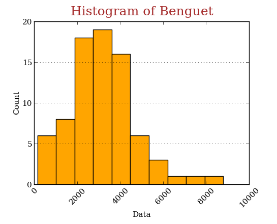
Do some customization on the histogram of Benguet,
 Other measures of central tendency such as Geometric and Harmonic mean, can also be computed using
head() and tail() methods, respectively; and to apply the summary statistics, use the describe() method,
The descriptions of the row labels:
count- number of observations;mean- sample mean;std- standard deviation;min- minimum value;25%- first quartile;50%- second quartile or median;75%- third quartile; andmax- maximum value.
var() method,Therefore, the volume of production in Kalinga is more disperse than the yields on other regions. Another measures of variability (relative variability) is the coefficient of variation (CV), which is defined as
variation function in the scipy.stats module,The CV is unit-less when it comes to comparisons between the dispersions of two distributions of different units of measurement. So assuming the yields from 5 regions have different units, then Abra is more variable than the other regions (Why? That is because the sample mean in Abra is more concentrated on the lower values, see the histogram below, and the range from its mean to its maximum is 47428.620253, compared to Kalinga (the one with the largest variance) with 38216.58228 only.) This makes the standard deviation of production in Abra larger than its mean.
To proceed, the measures of location, the $20^{\mathrm{th}}$ percentile of the data, which is the $2^{\mathrm{nd}}$ decile, is simply coded as,
Hence, 20% of the data in Ifugao are less than or equal to 6805.2, and the remaining 80% are more than that.
Next, utilize the
skew() and kurt() methods for computing the unbiased skewness and kurtosis, respectively,Thus, data in Abra is positively skewed and is leptokurtic; which is supported by the following histograms:
 |
| Click to enlarge |
scipy.stats.mstats.gmean and scipy.stats.mstats.hmean functions, respectively.
Comments
Post a Comment